This project was developed as part of the Open University’s Design and Innovation course. It combines service design thinking, user-centred research, and inclusive digital concept development to address a global issue aligned with the UN Sustainable Development Goals. The project demonstrates the end-to-end design process, from problem framing to prototyping an accessible digital experience.
This is the final version of the first of three posters. I used a prototyping tool called Figma for this project.
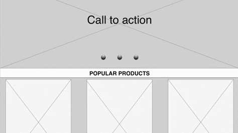
I used chunking and visual hierarchy to support readability and improve the user experience across key content areas.
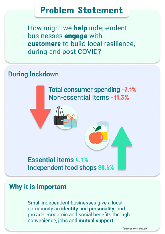
I felt it was important to explain concisely why it was important to help small independent businesses thrive. While looking for data on the importance of small independent businesses on the local high street, I found an article by The Institute for Local Self Reliance: https://ilsr.org/why-support-locally-owned-businesses/.
I applied layout and heading styles to improve content scannability and clarity, supporting both usability and accessibility. As an experiment, I broke the consistency rule on the 'Why?' paragraph by extending the margins and giving the text a flatter, longer appearance reminiscent of a 'base'. Later in the process, I decided to eliminate the shadowed #1 on the background as it made the design look busy and unclear.
I also changed colour patterns several times and only got to this stage while working on this assignment's second phase (poster). The illustrations are part of a free plugin within Figma called "Blush.'
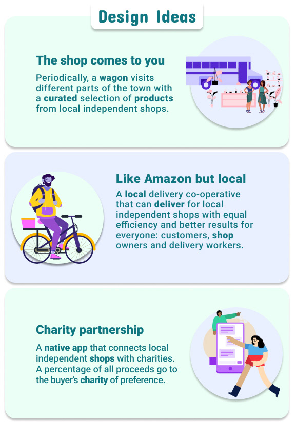
For this phase, I felt it was easier to continue developing the posters as I had moved on from the ‘blank sheet of paper stage’ and already had something in mind to create.
I occasionally hesitated about colour combinations and how I could represent the ideas from the creative session, particularly in terms of contrast and clarity, and referred to accessibility tools (e.g. contrast checkers) to ensure WCAG compliance.
Communicating my creative process was tough as I tend to work and make corrections as I go along. I am happy to work on a design for hours, but recording and describing the process is complicated.
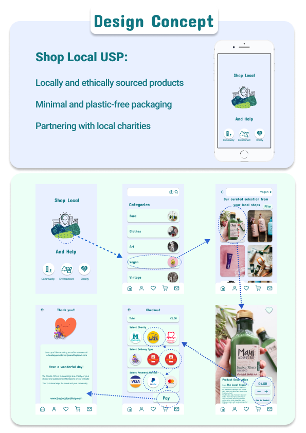
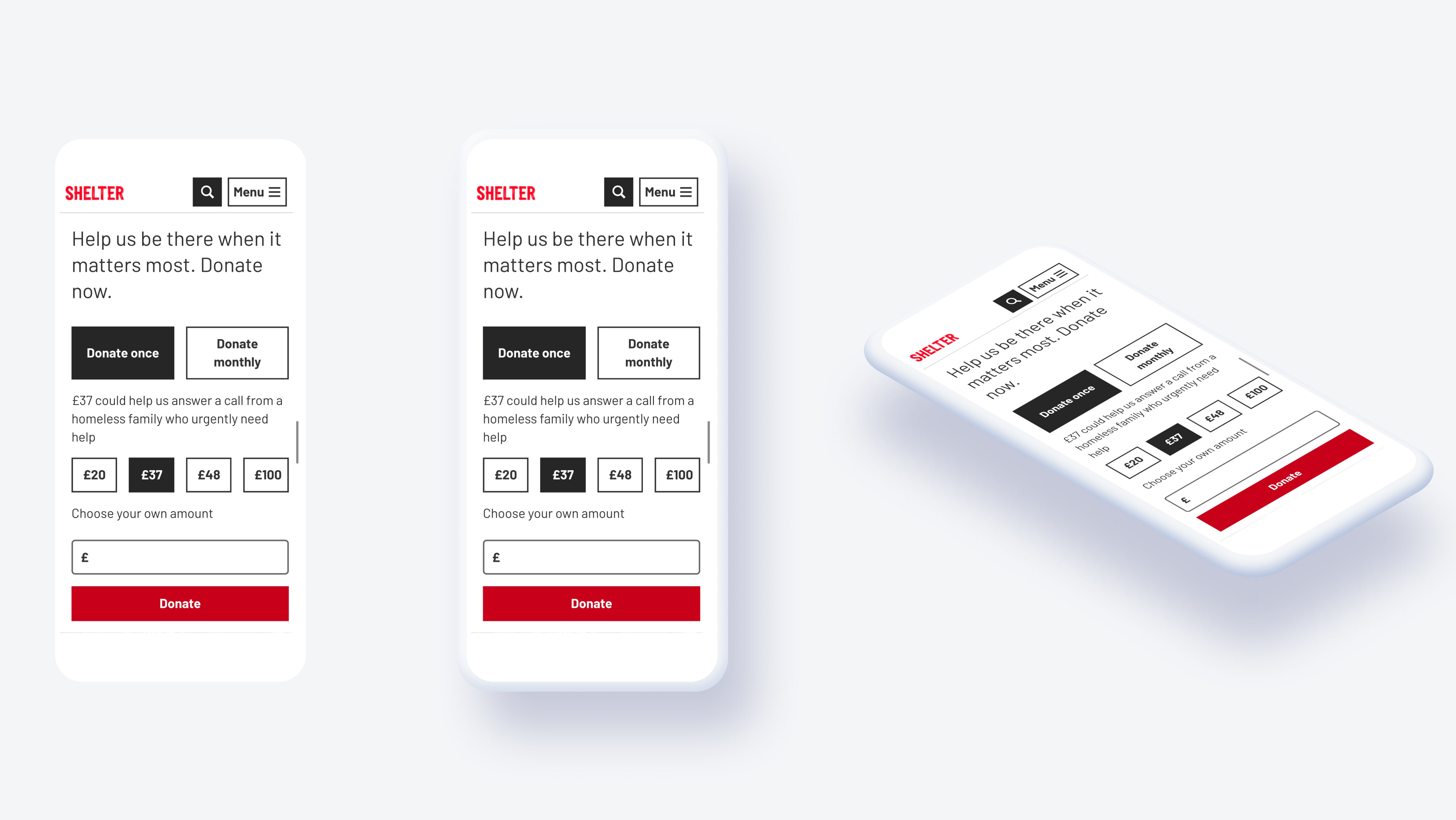
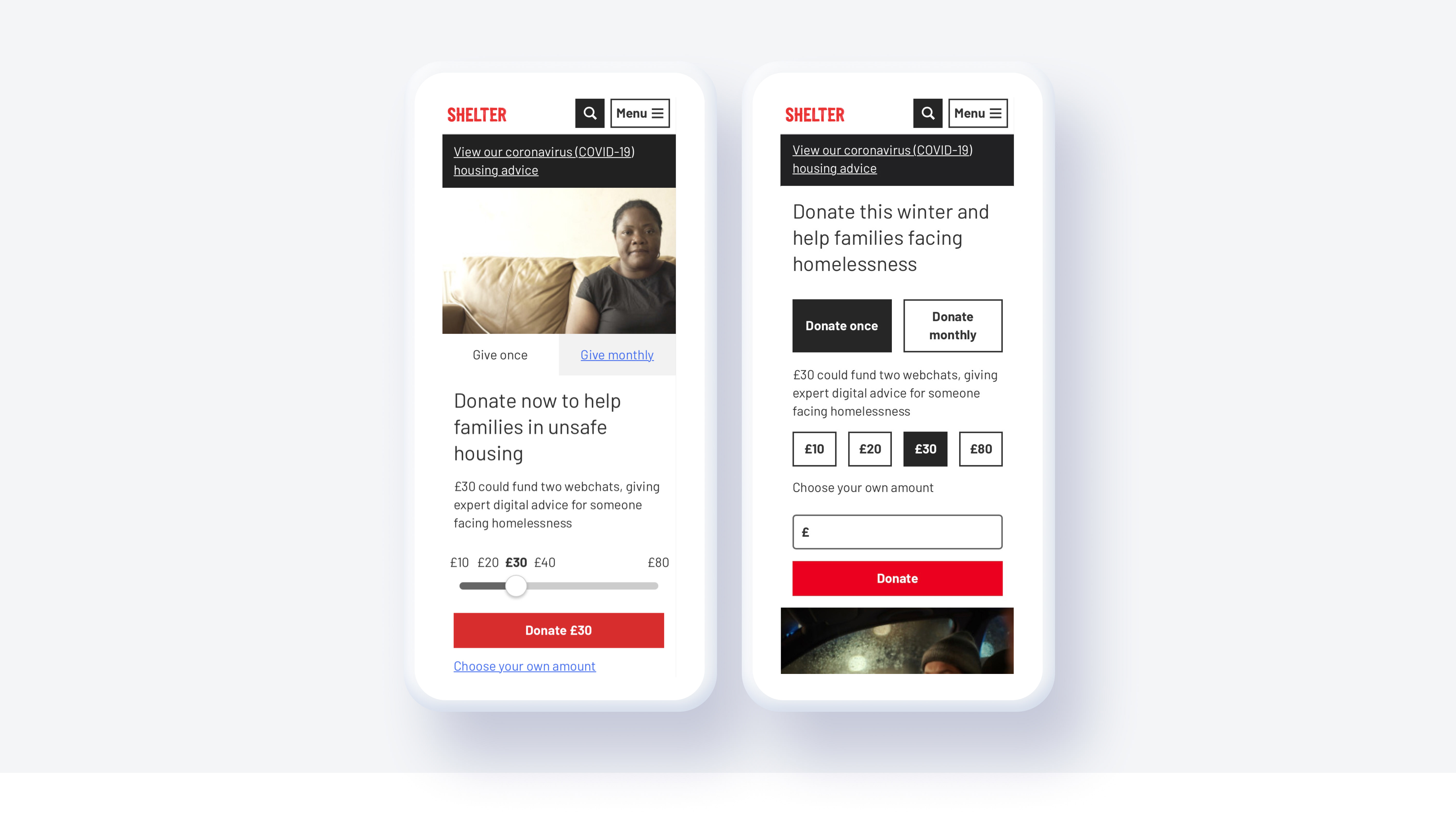
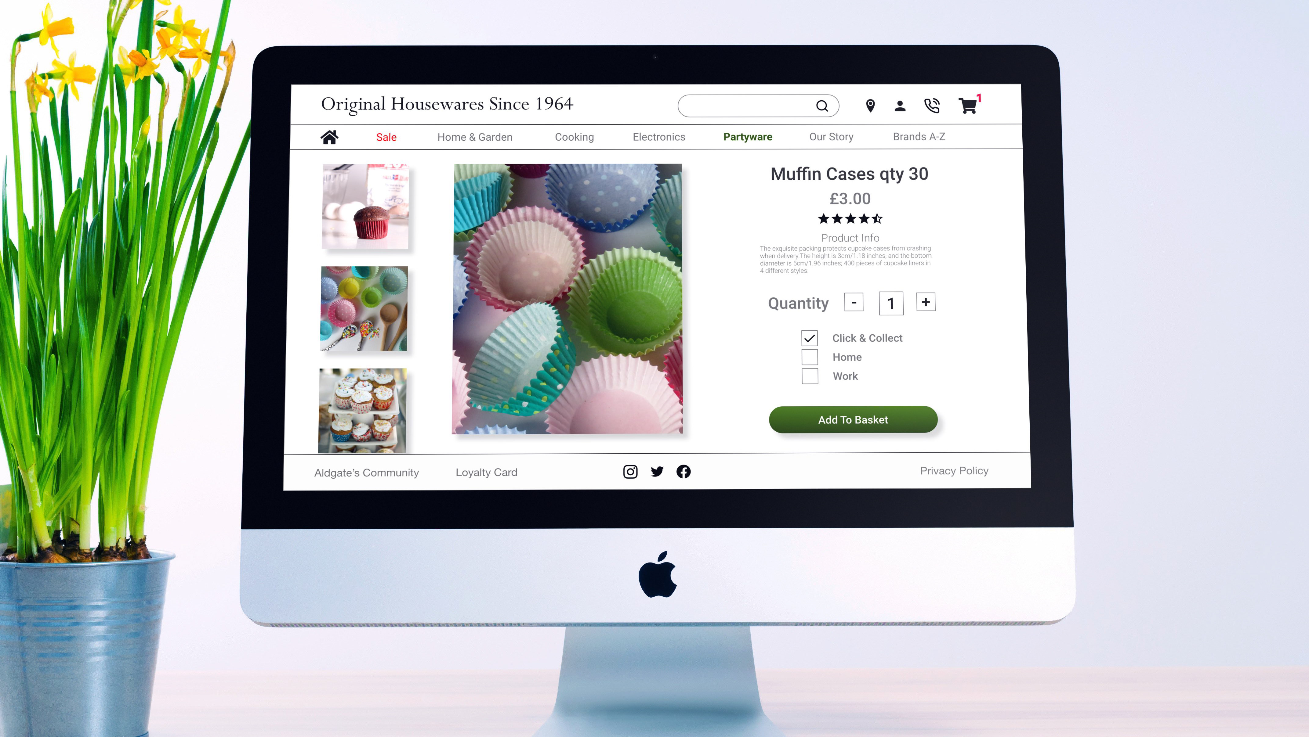
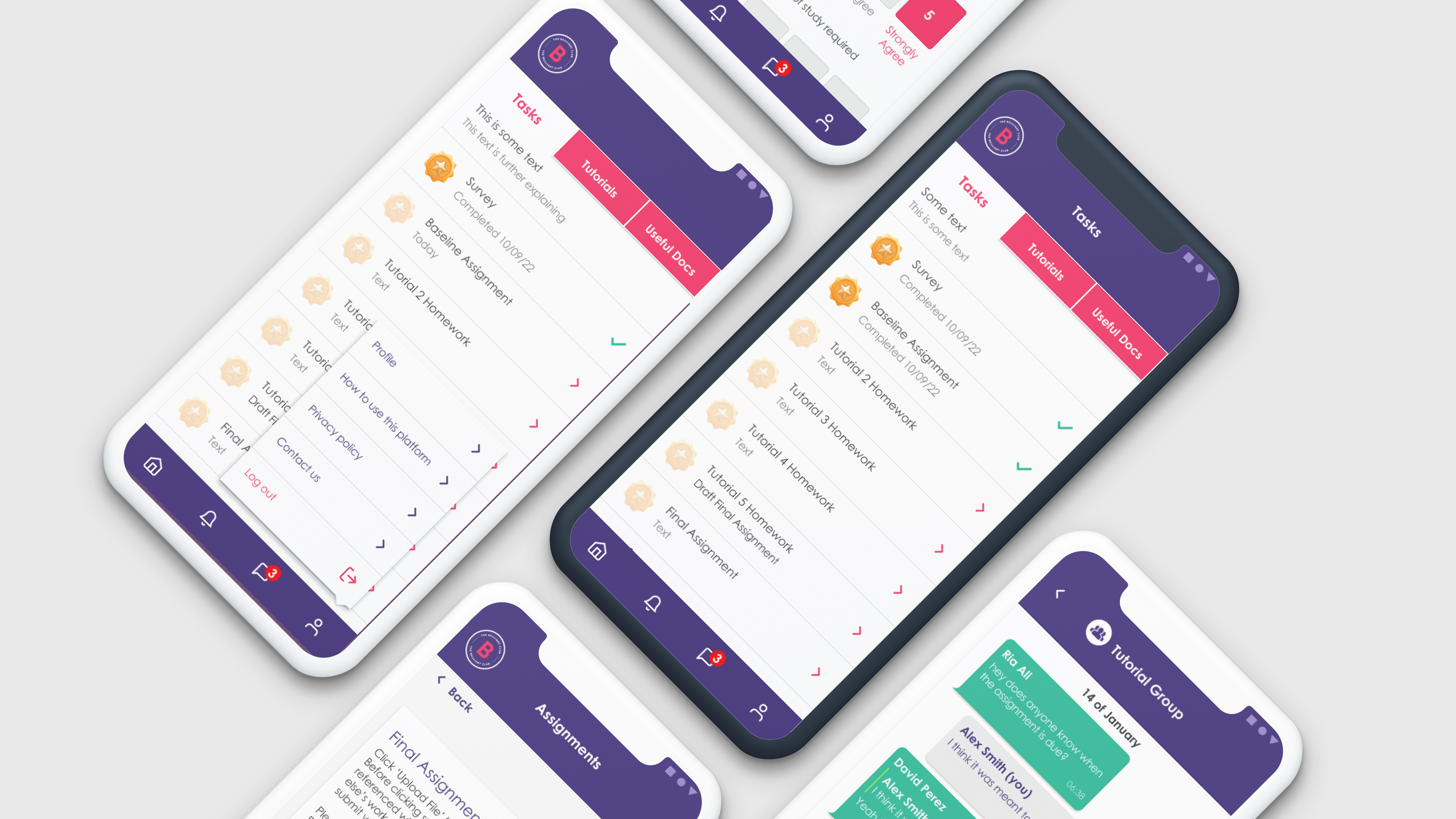
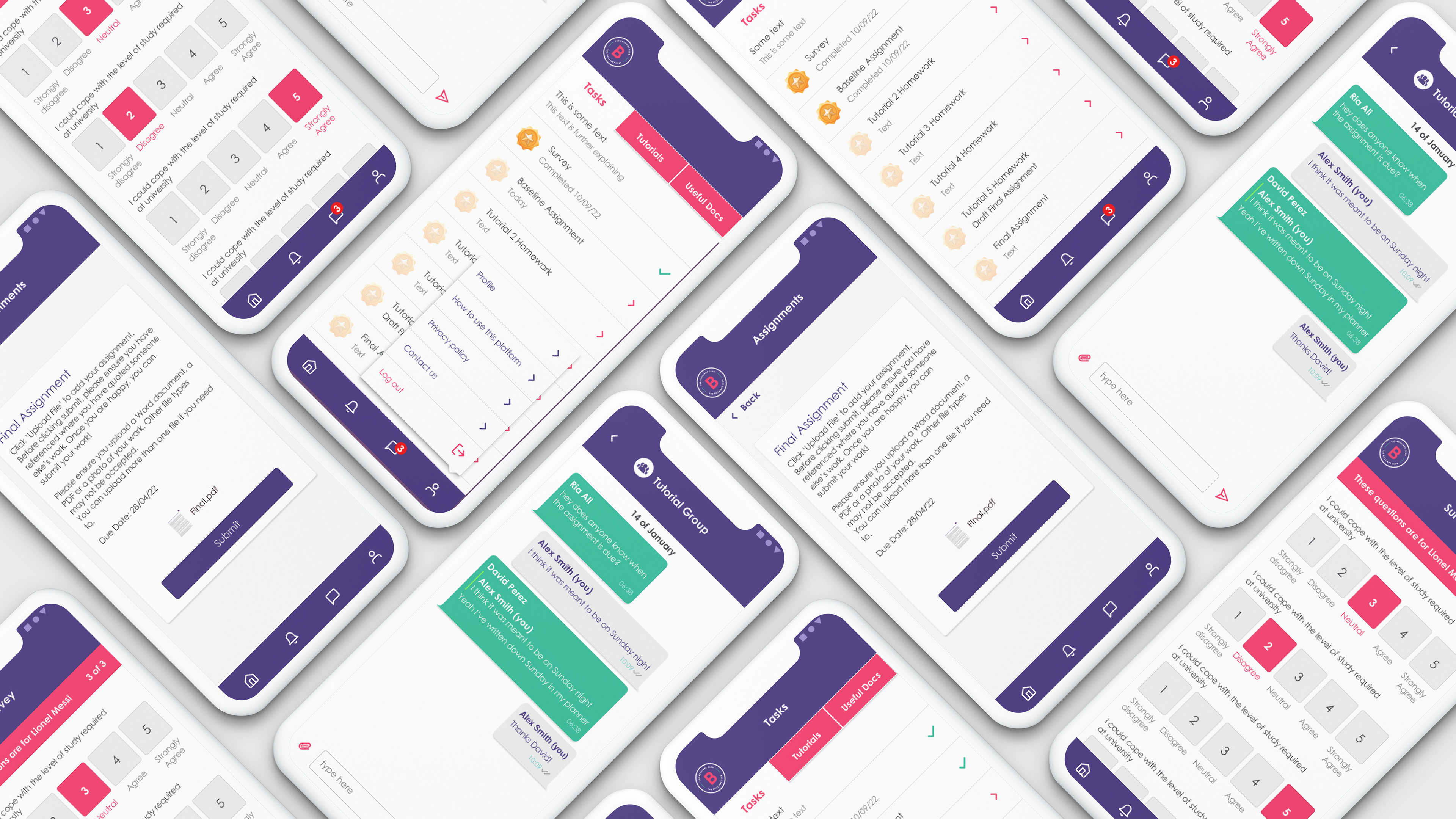
I chose to prototype an application because the alternative was to design a service, and I felt more confident developing an interactive prototype.
The criteria I used to evaluate the success of my concept was how user-friendly and inclusive it was. For my idea to be truly accessible and user-friendly, I had to use tools such as a contrast checker. I used this to check the readability of the text.
I conducted informal user testing throughout the process and gathered ongoing feedback to inform iteration. While informal, this user insight was critical in shaping the interaction design and usability of the prototype. I need to observe and see how others react to my designs. This is not to say that I can take on board everyone's ideas, but there's room for constructive ideas, and they can often guide me at specific points in the design process. I see this as collaborative design leadership, I welcome feedback and test ideas widely, but I’m confident in making the final decisions based on user needs and design goals.
While making the final poster, I considered that I could have used a different orientation than the one I'd chosen (i.e. landscape rather than portrait). However, I found myself short on space, which made it more challenging to let the app stand out. And I'd chosen to use the same colour pattern for both poster and concept design (app), which I could've done differently on reflection.
If I were to do this again
If I were to revisit this project, I would take a more structured approach to prototyping by using established design systems such as Google’s Material Design and Apple’s Human Interface Guidelines. This would help ensure consistency, accessibility, and cross-platform usability, all of which are key to delivering high-quality digital experiences.
This concept explores how inclusive, user-centred digital experiences can be developed through service design. It gave me the chance to practise balancing user needs with visual clarity, accessibility considerations, and narrative structure, areas I continue to build on in my design work.